new
Funnels and Websites
Mobile responsive editing in Funnel and Website Builder: Phase 1 🚀🚀
We have made it easier than ever to build mobile-responsive funnels and sites.
It introduces a hierarchical approach to adjusting font sizes for desktop and mobile views, providing users with more control over the appearance of their content on different devices.
😎
New Features:
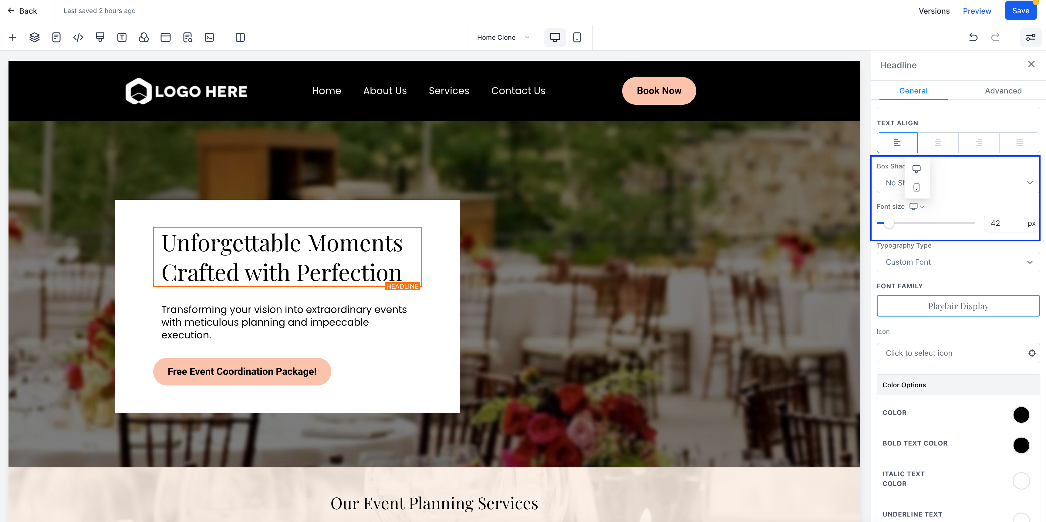
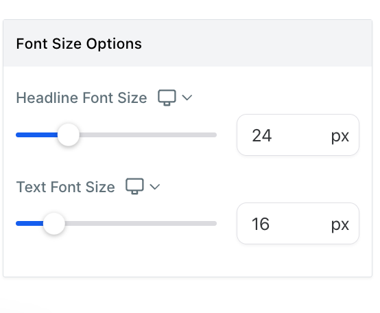
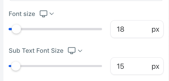
😎Hierarchical Font Size Settings:
Users can now set separate font sizes for desktop and mobile views, ensuring optimal readability and visual consistency across various screen sizes.Improved Mobile Editor:
The mobile editor has been updated to include options for adjusting font sizes specifically for mobile responsiveness, making it easier for users to customize their designs for smaller screens.😍😍
How to Use:
😍😍- To change the font size of a text element in the new funnel builder and make it responsive across different devices, follow these steps:
- Select the desired element in the funnel builder, such as a headline.
- Go to the element settings and navigate to the font size option.
- Adjust the font size for desktop. This change will also apply to mobile devices.
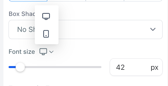
- Click on the desktop icon to switch to the mobile view.
- Change the font size specifically for mobile. Note that this change will not affect the font size on desktop.
- To modify the font size for desktop again, switch back to the desktop view and make the necessary adjustments. This change will only affect the font size on desktop.
Benefits:
😇Simplified Workflow: The new hierarchical font size settings streamline the process of managing mobile responsiveness for text elements.
Consistent User Experience: With the ability to set specific font sizes for desktop and mobile, users can ensure that their content is displayed consistently across various screen sizes.
🤩
What's Next:
🤩While this release focuses on font size adjustments for mobile responsiveness, we have exciting plans for further enhancements. Here's a glimpse of what's coming next:
- Text Alignment: Users will be able to align their text elements precisely for both desktop and mobile views, ensuring optimal readability and visual appeal.
- Letter Spacing: Fine-tune the spacing between letters to achieve the desired typography effect on different devices.
- Opacity: Control the transparency of text elements to create subtle overlays or highlight certain parts of the content.
- Margin and Padding: Adjust the spacing around text elements to improve layout and optimize readability.
- Shadow Effects: Add shadows to text elements for depth and visual impact.
- Color Customization: Choose custom colors for text elements, allowing for greater branding consistency and design creativity.
Note: This is Phase 1 of the improvements. Many more mobile editor options are coming in text alignment, letter spacing, opacity, margin and padding, shadow, colors etc.
🔥🔥Some screenshots🔥🔥