new
Funnels and Websites
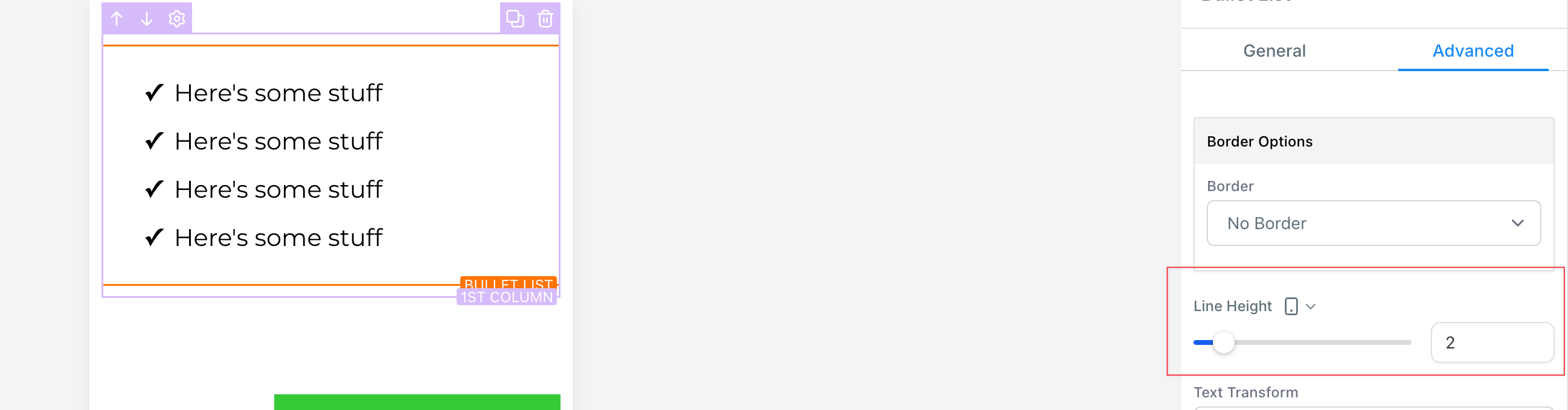
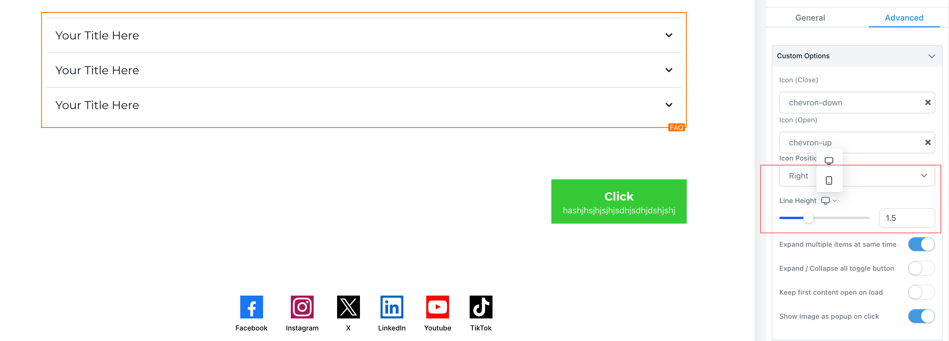
Mobile responsive editing in Funnel and Website Builder: Line Height for All Elements 😍😍
We're thrilled to introduce a new enhancement to line height settings of all the elements. Now with advanced customization options, you can set different line alignments for mobile and desktop views, ensuring optimal readability and design across all devices. We have made it easier than ever to build mobile-responsive funnels and sites. In response to user feedback, we've implemented significant enhancements to various text elements within the platform, ensuring a seamless and optimized experience for mobile users
🤩🤩
New Features:
🤩🤩- Universal Line Height Control:Effortlessly adjust the line height for text in all elements, including headlines, paragraphs, and bullet lists etc.
- Responsive Settings:Customize line height individually for desktop and mobile views to maintain readability and design integrity across platforms.
🔥🔥
Some example use case of this feature:
🔥🔥- Perfecting the look of long-form articles by adjusting paragraph spacing
- Enhancing the legibility of bullet points with tailored line height
- Improving the visual impact of headlines through strategic spacing adjustments
🚀🚀
Major Paint point solved
🚀🚀Now there is no need to create multiple sections and keep different line height in multiple devices and hide from one device.
🥳
How to Use:
🥳To change the line height of an element in the new funnel builder and make it responsive across different devices, follow these steps:
- Select the desired element in the funnel builder, such as a headline, paragraph, faq etc.
- Go to the element settings and navigate to the line height option.
- Adjust the line height for desktop. This change will also apply to mobile devices.
- Click on the desktop icon to switch to the mobile view.
- Change the line height specifically for mobile. Note that this change will not affect the line height on desktop.
- To modify the line height for desktop again, switch back to the desktop view and make the necessary adjustments. This change will only affect the line height on desktop.