new
improved
Email Builder
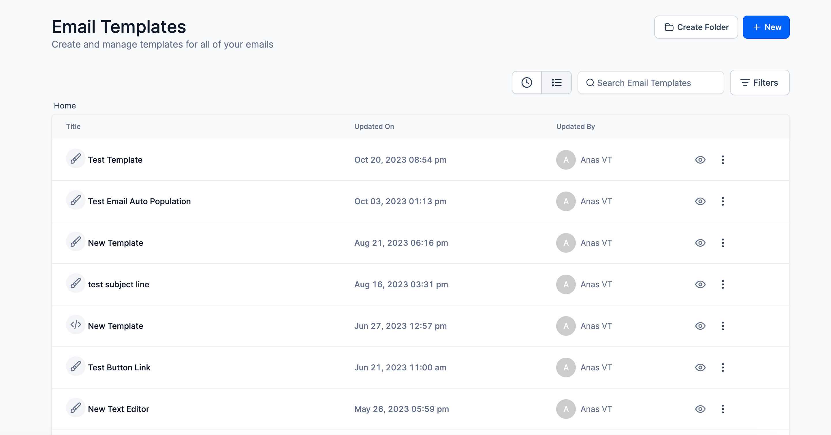
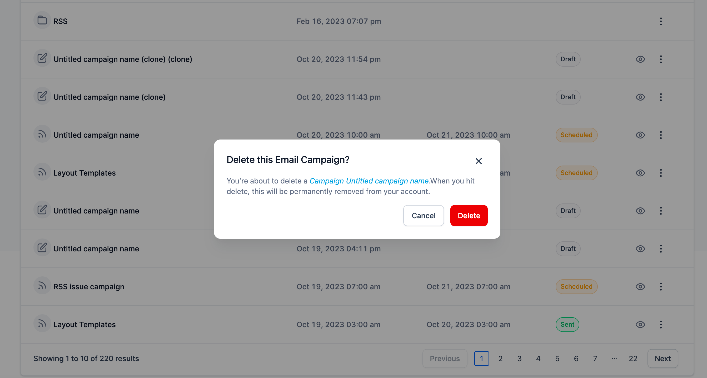
😇 Enhanced List View UI of Email Builder
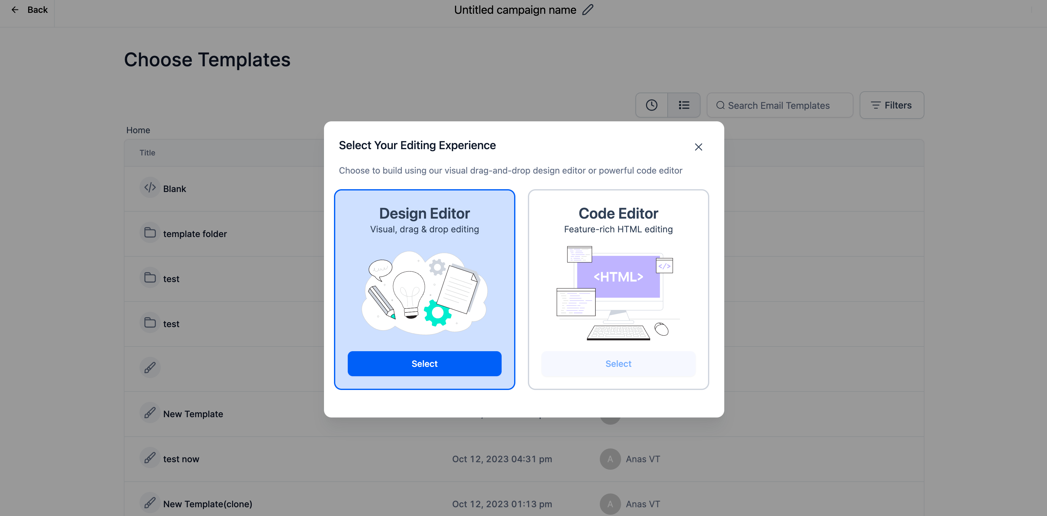
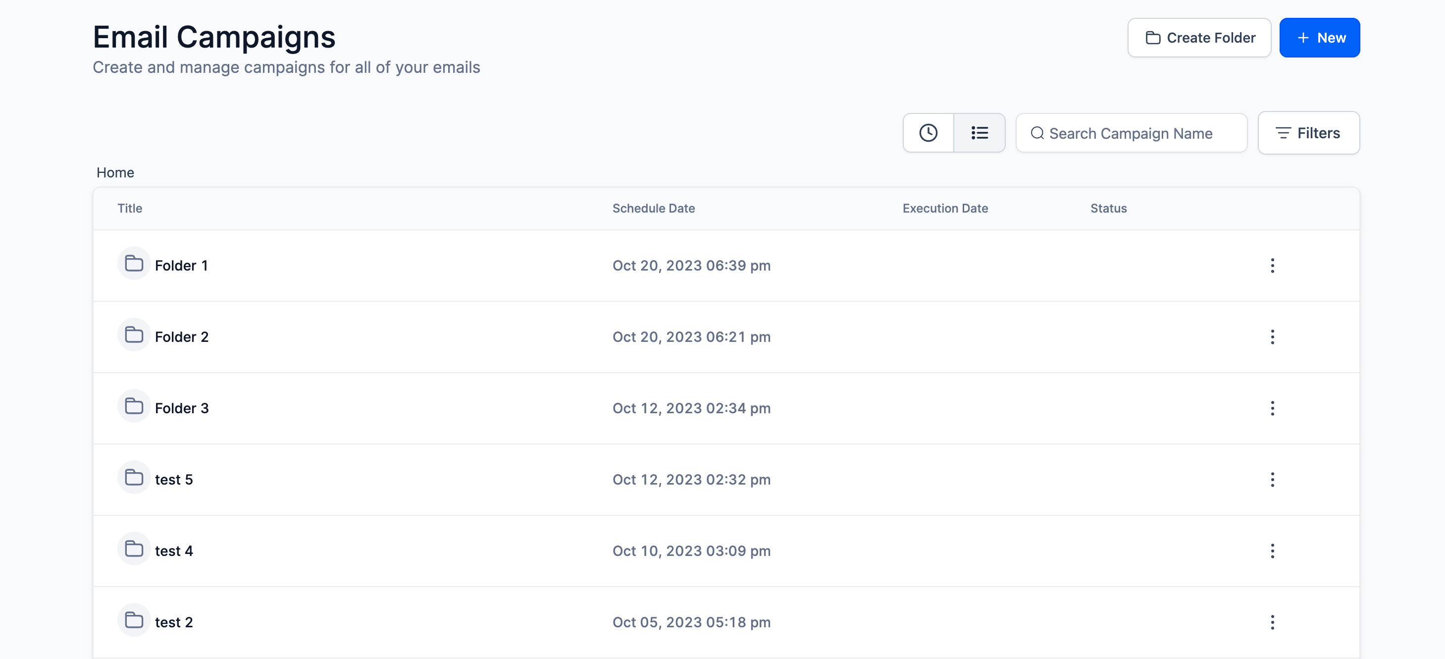
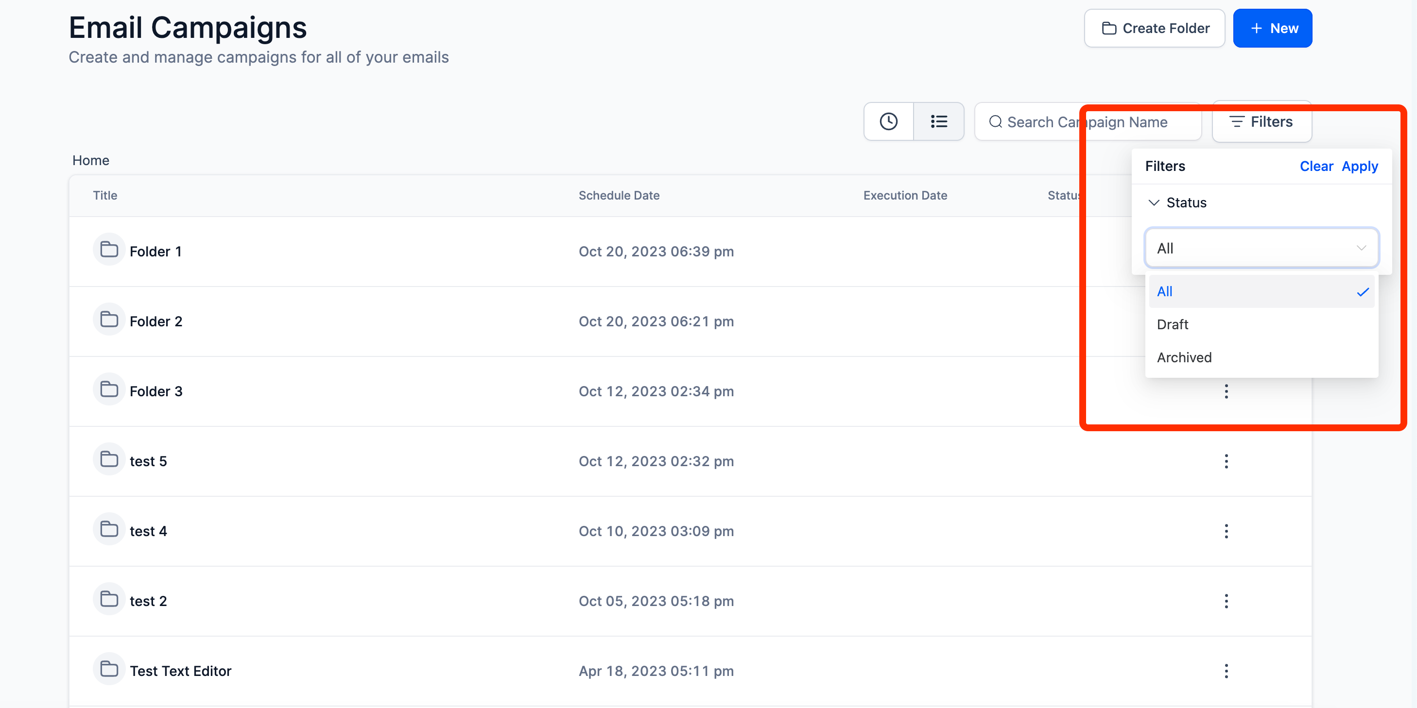
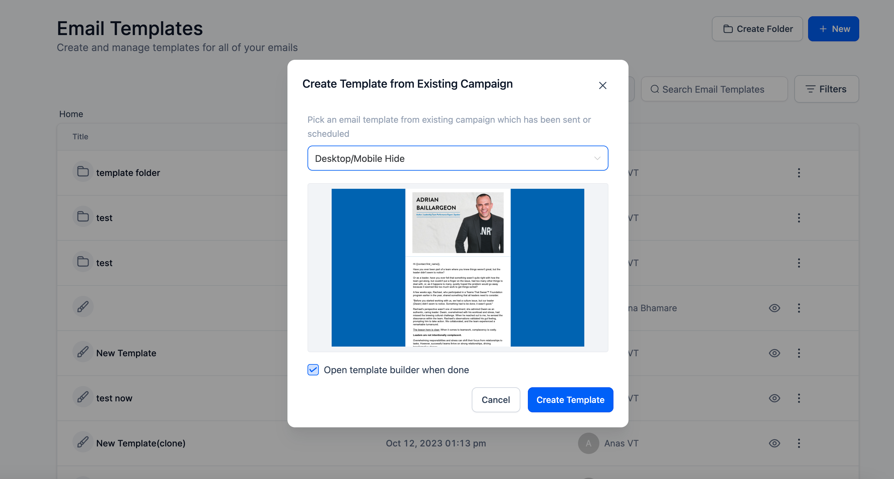
Email Builder has launched new UI for Email Templates and Campaign List View and Dropdown options to match UX and UI of Refined Builder.
When it comes to lists and dropdowns, which are common components in many interfaces, there are several reasons why designers might seek to create new or improved UI elements:
😇
Improved User Experience (UX):
- Clarity and Readability: A well-designed UI can make it easier for users to understand and interact with lists and dropdowns. Clear labels, proper spacing, and intuitive icons can enhance readability.
- Efficiency: A well-organised list or dropdown can help users quickly find and select the information they need, improving overall efficiency and productivity.
😎
Consistency:
- Brand Identity: A new UI design can align the list or dropdown with the overall brand identity and visual style of the application, providing a more cohesive and polished look.
- Consistency Across Platforms: It's important for the UI to be consistent across different devices and platforms for a seamless user experience.
🤩
Performance Optimisation:
Efficient Rendering: A redesigned UI can leverage modern technologies and best practices for rendering, ensuring smooth performance, especially in applications that handle large amounts of data.
Email Builder has changed the UI for Email List, Create Option and Action dropdowns
. We have plans to do the same for send and schedule screen in this quarter.