new
Reporting
Dashboard
🚀🚀Design Enhancement of Dashboard
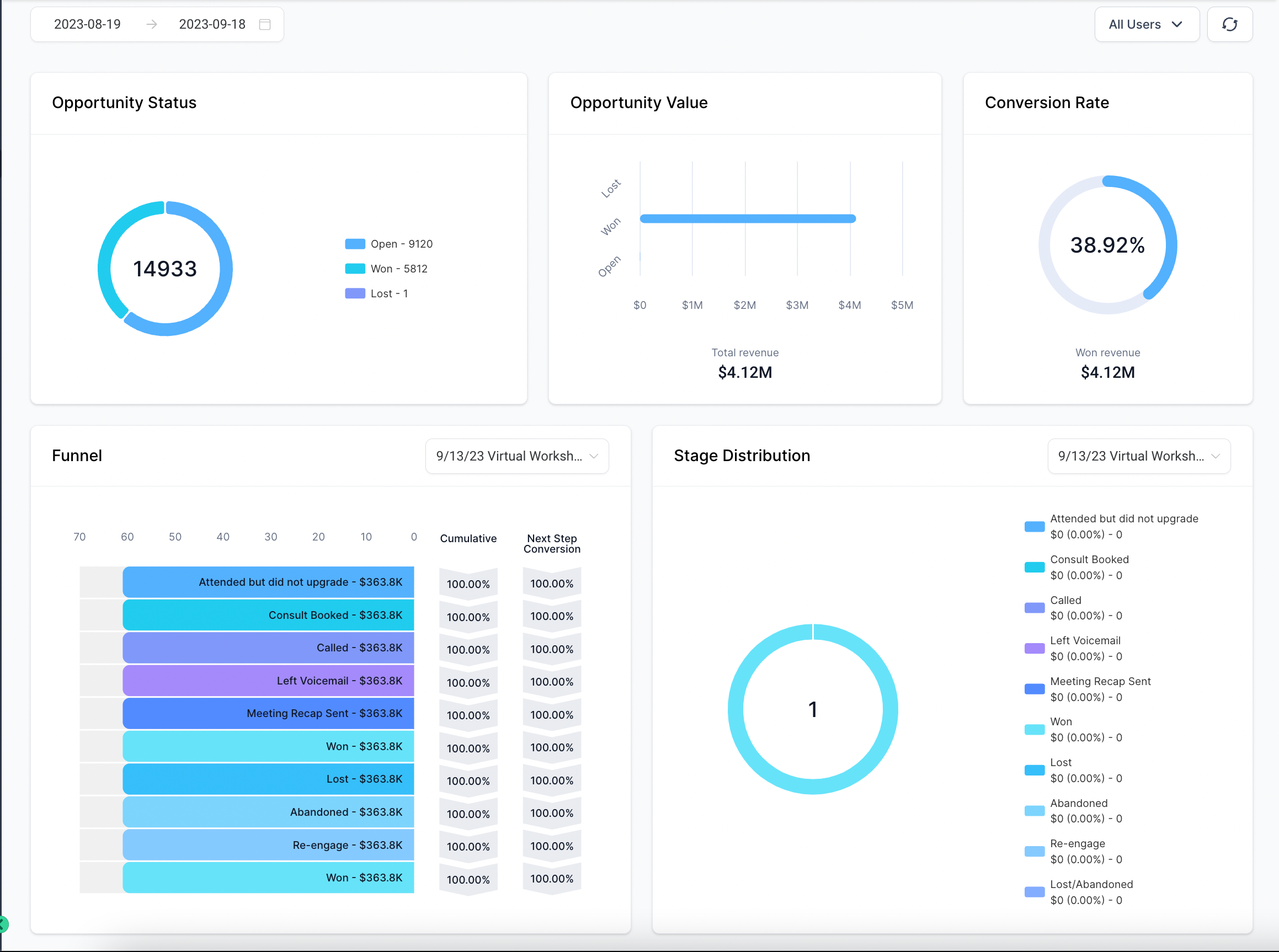
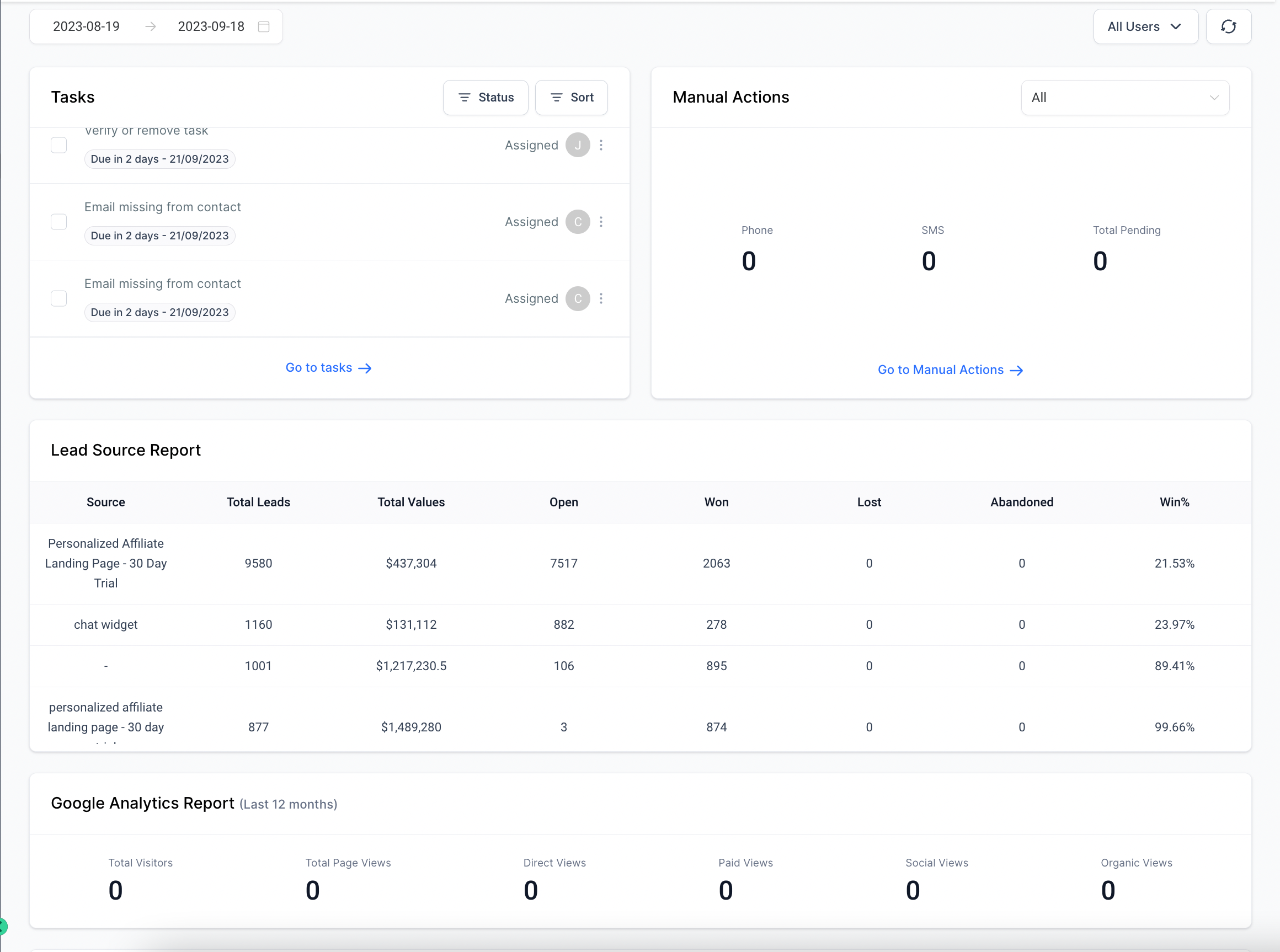
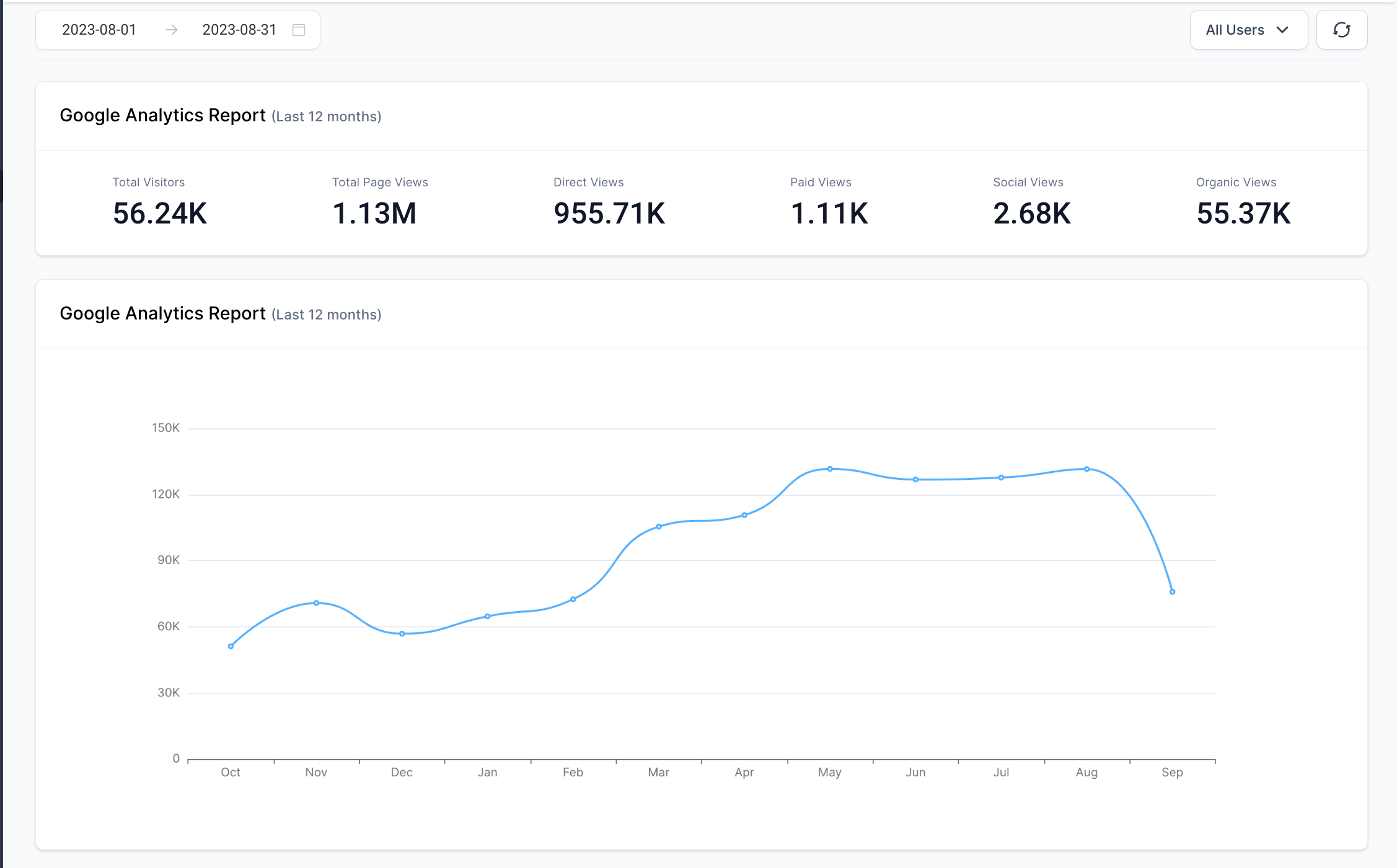
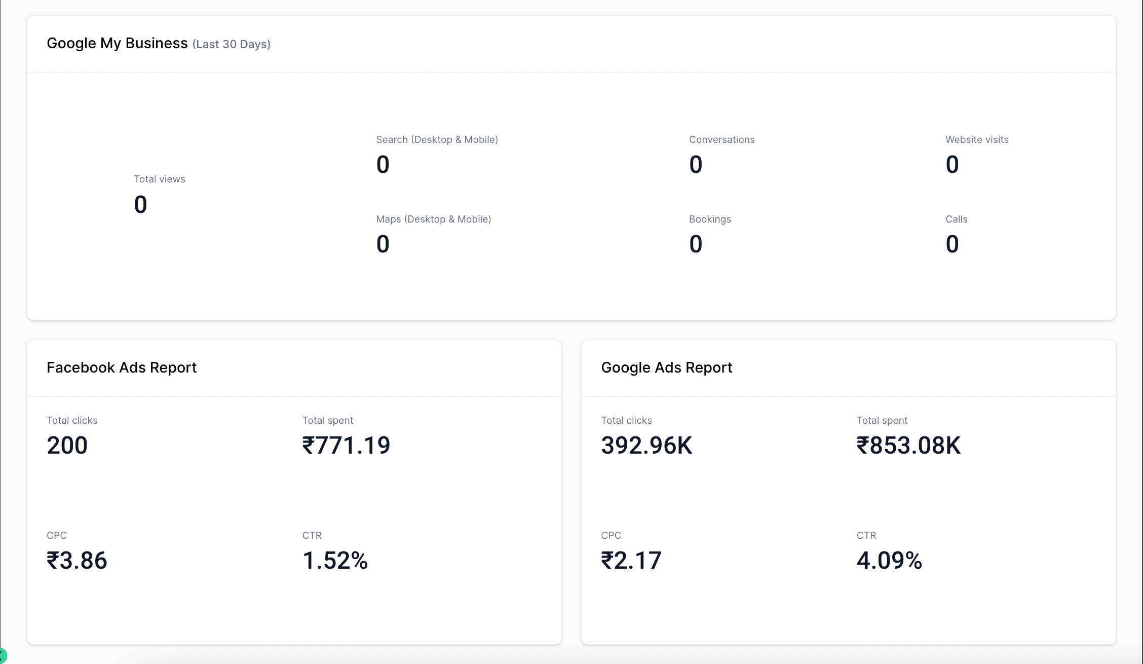
Dashboard went through major design change to provide more better accessibility. A dashboard is like a turbocharged control center! It dazzles with dynamic charts, graphs, and metrics, offering a high-speed snapshot of crucial info. It's your secret weapon for lightning-fast decisions and keeping an eagle eye on performance! 🚀📊🔥
Dashboards offer a multitude of advantages, making them an indispensable tool in various fields. H ere are some key advantages of using a dashboard:
- Data Centralisation: Dashboards bring together a wide range of data from different sources into one centralised location. This allows for a comprehensive and holistic view of information.
- Visual Representation: They present data in a visually engaging and intuitive manner, often through charts, graphs, and other visual elements. This makes complex information easier to understand and interpret.
- Real-time Monitoring: Many dashboards can display real-time or near-real-time data, enabling users to monitor key metrics and performance indicators as they happen.
- Customization and Personalisation: Dashboards can typically be customised to cater to specific user preferences and needs. Users can often choose what data they want to see and how it is displayed.
- Performance Tracking: Dashboards are invaluable for tracking key performance indicators (KPIs) and metrics. This allows for a quick assessment of how well an individual, team, or organization is meeting its goals.
- Decision Support: They provide decision-makers with the information they need to make informed choices. By having all relevant data in one place, decisions can be made more efficiently and with greater confidence.
Overall, dashboards are powerful tools for managing and visualizing data, which can lead to better decision-making, improved performance, and a more efficient use of resources across various domains, including business, finance, healthcare, and more.
😍
Why did we do this change? What are we planning as big picture?
Hold onto your hats because we're about to revolutionise how you navigate and analyze data! Picture this: a brand-new, supercharged Dashboard and Reporting system! We're talking about the power to customise subaccount dashboards/reports with a simple drag-and-drop feature, and cherry-pick custom widgets that suit your every need. This is not just an upgrade; it's a game-changer, designed to supercharge your experience and give you unprecedented control over your data. Get ready to explore a whole new world of possibilities! 🚀📊💥
😍
Things which has changed?
- Opportunities widgets like status, value and conversion rate work on created/updated opportunity status.
- If a user doesn't have access to particular module, they will see the chart as locked and permission will be required.
- We have streamlined the brand colors and acquired sleek charts to enhance usability
- We have filter option of users of sub-account.
- We have added one global date filter at top.
🚨🚨🚨
Note
- Once this release is rolled out to all production accounts, it's important to note that it may cause Custom CSS to become incompatible, as we're transitioning towards a more user-friendly drag-and-drop dashboard interface.


